Verbindings
Verbindingskerk
Verbinding means connection in Dutch, kerk means church. Two different church organizations in the Netherlands merged together and create one unified community. We curated a brand for this new church community.
Deliverables
Logo Design
Concept Creation
Branding
Marketing Collateral
Client
De Verbindingskerk
(cooperation NGK/GKv)
Creating a welcoming look
The decision was made to include a rainbow color scheme from one of the paintings in the church, signifying God’s promise to mankind, as a symbol of hope and faithfulness. It also represents inclusivity and diversity so that everyone feels welcome, even if it is just for a cup of coffee.

It’s all about connection
A ligature compatible font was used to create a sense of connection and flow. These specific ligatures can be used as a distinctive brand element, creating a cohesive look and feel that represents the church.

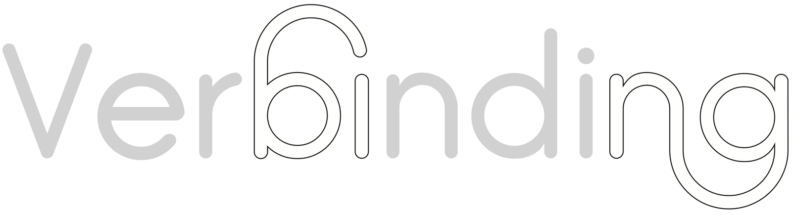
Connecting letters through ligatures
A ligature occurs where two or more graphemes or letters are joined to form a single glyph.
Gather and Connect
The logo concept was created with the story of the church being the foundation. The ‘V’ of Verbinding represents the individual spreading arms, reaching out towards the sky. Holding hands to form a community and gather around the cross of Jesus, connected.


Branding and Stationary
The concept within the logo is represented throughout every product. The rays of the rainbow and the community shine through on the stationary. The plentiful colors are proudly displayed, as they were created by God, to remind people to be joyful and proud.