
This app was created for customers of Manzoku Sushi, an emerging restaurant chain that offers sushi and Japanese cuisine with competitive pricing. The goal was to create an easy to use, convenient option to quickly place a food order and make a payment in between a busy schedule.
Deliverables
Case Study
UX Research
Responsive UI App Design
Branding
Client
Manzoku Sushi
Market research
What’s happening in the market
60% of U.S. consumers order delivery or takeout once a week.
45% of consumers say that mobile ordering or loyalty programs would encourage them to use online ordering services more.
43% of restaurant professionals said they believe third party apps, many of which withhold data, interfere with the direct relationship between a restaurant and its customers.
The problems with online food ordering
According to the data collected 70% of consumers would rather order from a custom app than a third party. There is a trend emerging to give back to local businesses, and people are willing to spend more at their favorite restaurants when using a dedicated app. Many sushi restaurants do not have dedicated pick up and/or delivery services and 3 out of 4 sell through a third party platform.
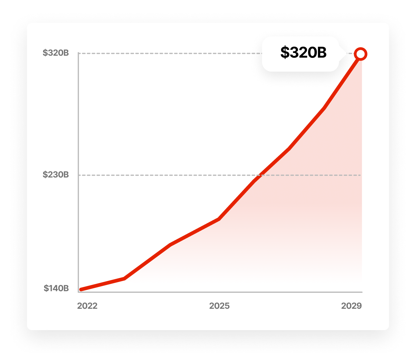
The food delivery industry is expected to grow to $320 billion by 2029. It saw its largest growth in five years in 2020 due to the coronavirus pandemic.
According to the article ‘Food Delivery App Revenue and Usage Statistics (2022)’ from Business of Apps.
Competitive Analysis
The 3 most relevant competitors have been analyzed, comparing the app and website experience for desktop and mobile, navigation, accessibility, user flows, UX interactions, visual designs, content and critical app store reviews.

1 – Kura Sushi

2 – Little Lilly Sushi
3 – Doordash
The good
Organization and site structure is good
All websites are responsive and have clear navigation
The bad
Apps are outdated (1), or no app/web app at all (2)
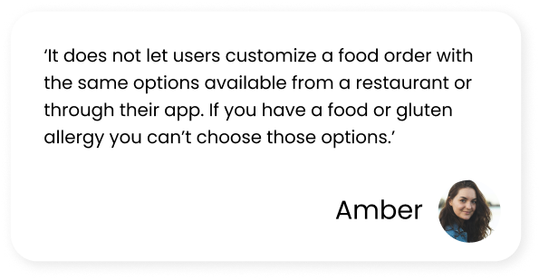
No allergen information (2), or not always displayed (3)
Amount of sushi included with an order is confusing (1,2,3)
Visual identity is not cohesive and not always accessible (1,2)
Ordering redirects to a third party or is not available, breaking continuity during the ordering flow (1,2)
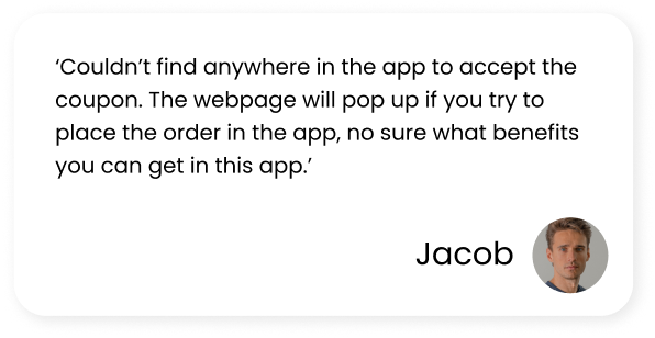
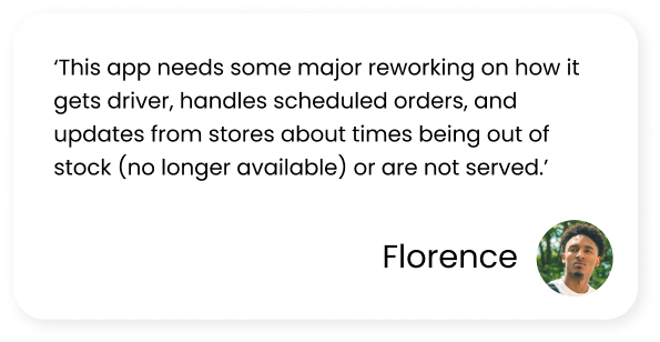
Critical Comments
User Survey
A quick survey was conducted to see the challenges people are facing while using food delivery apps. This will help to give insights into what can be improved for a better user experience, and start designing with these problems in mind.


Initial Research Concludes
There is a growing need for food delivery apps that don’t involve a third party. The app should be easy and convenient to use, accessible to all users, and cater to people with allergies or language barriers.
Personas
Two personas were created to explore the larger group of users, to design the app with the target users in mind.


User Journey Map
A user journey map was created to identify the experiences and challenges the customer might go through while ordering in the traditional way.

Time to start designing!
After going through all the research data, it was time to sketch out the first flows, the initial low-fidelity wireframes and start creating prototypes.
Flow Diagram
A flow diagram was created to outline all the neccessary functionality of the main tasks the user goes through. Fail states were also created, but are not shown due to space constraints.

Low-Fidelity Wireframes
Once the flow diagram was established, low fidelity wireframes were created for the main flows,

Lo-Fi prototype usability study feedback
Users wanted the ability to change/cancel orders.
The location filters were confusing to some users and needed to be more intuitive and easy.
It needs to be clearer if a user is placing a pickup or delivery order.
Flow Diagram
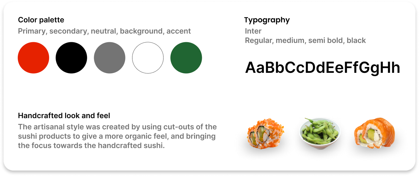
Once the initial flow was created, and the usability study results were in, it was time to start creating the high fidelity prototype. The feedback from the usability study will be incorporated and at this point the decisions for the UI are made by experimenting with color, fonts and elements. A UI style kit was created to create consistency and continuity.

Design Ideation
The UI design went through several iterations. The first version were too cluttered and made navigation unnecessarily difficult for users that are in a hurry. Following people’s feedback and improving the design by removing everything that was irrelevant has led to the final design of the app.
Previous Design Mistakes

Alignment and Grid
The app was created using an 8 point grid system and the margin between groups is set at 16, with margins between groups are set at 16, 24 and 32. Bounding boxes are set at 44×44 to prevent misclicks, and buttons are a minimum of 40×40 for easier tapping.

High-Fidelity Prototype
The high-fidelity mockups were connected into a clickable prototype. This way the app can be tested on the first group of users

Prototype validation by conducting a usability study
After the high-fidelity prototype was finished, it was tested by 4 users in an unmoderated usability study. A research plan was made for a where research questions and goals were outlined, KPIs, methodology, information about the participant requirements, and a script with tasks to complete. Part of the study was conducted through Maze.co, giving heatmap information, misclick rates and task duration. After the study was completed, each user completed a System Usability Scale questionnaire through Google Forms.
Tasks given to the users included, following the sign-up process, adding menu items to the cart, complete the checkout process for a delivery order, and tracking the order status.

Results
100% of participants were able to complete all tasks without issues. However, in the feedback session there was some notable feedback. One participant noticed the inability to exit the checkout flow, since these did not contain any back buttons. Another user mentioned that they usually login via their Google account, or make a payment through Apple Pay.
Prototype update concept
Because of time constraints a second usability study on the updated prototype couldn’t be conducted. However, the prototype was updated by adding the option to login with Google or Facebook. Back buttons were also added to the complete checkout flow, this way users can exit if they change their mind.
Accessibility Check
The app has been evaluated for contrast to match at least the AA standards of WCAG. All the main colors of the app, text, and call-to-action buttons, have been checked using the ‘Contrast Checker’ tool by WebAIM. Ensuring the app is accessible to every user.